Illustration and illumination
The invention of printing meant that books could be produced fairly rapidly in large numbers. It is estimated that an average print run for one edition could range from 250 to 870 copies. However, this by no means meant that all copies of an edition were identical. Like manuscripts, incunabula were largely dependent on manual labour, if not for the writing, then certainly for the decorating, which was usually commissioned by the first owner.

Illuminated incunabula
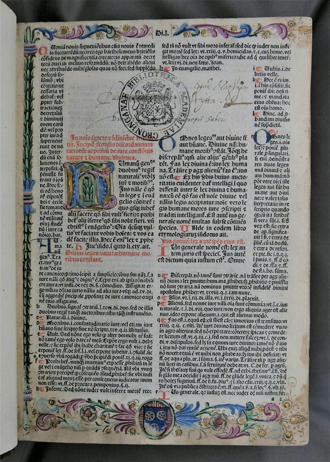
A copy of the Decretum Gratiani shows how owners could personalize their printed copy by commissioning the illumination. This edition was printed in Venice in 1486 and it contains a legal text written in the twelfth century by the Italian jurist Gratianus. The margins around the printed text are decorated with floral motifs and acanthus leaves. The commissioner’s family coat of arms has been added at the bottom margin. Although printed, this page does not look markedly different from contemporary manuscripts. It reveals how the rise of printing in the fifteenth century did not bring about a radical change in the appearance and production of books. Many practices from the manuscript trade continued to be employed in incunabula and even in later printed books.
![Inc. 189. Wilhelmus Frederici’s coat of arms in his copy of Vincent of Beauvais’ Speculum naturale, fol. [a2]r](/library/_shared/images/bc/virtual-exhibitions/material-evidence/4-1.jpeg)
Ownership and self-presentation
For Wilhelmus Frederici, too, illumination gave him a convenient opportunity as a proud book owner to display his ownership. He owned a copy of Vincent of Beauvais’ Speculum naturale, an encyclopaedic text about creation and the natural world. As his other book had mentioned earlier, his copy had been printed by Adolf Rusch in Strasbourg in 1476 and Frederici had commissioned the rubrication. On the very first page, the text starts with an initial ‘Q’ for ‘quoniam’, which has been decorated with Frederici’s coat of arms. The banderol below it reads: ‘magister wilhelmus frederici artium doctor et medicine’. Although he held an important religious position, here he specifically presents himself as a doctor in humanities and medicine. Clearly, such ownership marks were intended not only to document his ownership, but also to present himself as a learned man.
![Inc. 189. Wilhelmus Frederici’s coat of arms in his copy of Vincent of Beauvais’ Speculum naturale, fol. [a2]r](/library/_shared/images/bc/virtual-exhibitions/material-evidence/4-2.jpeg)
Hybrid books
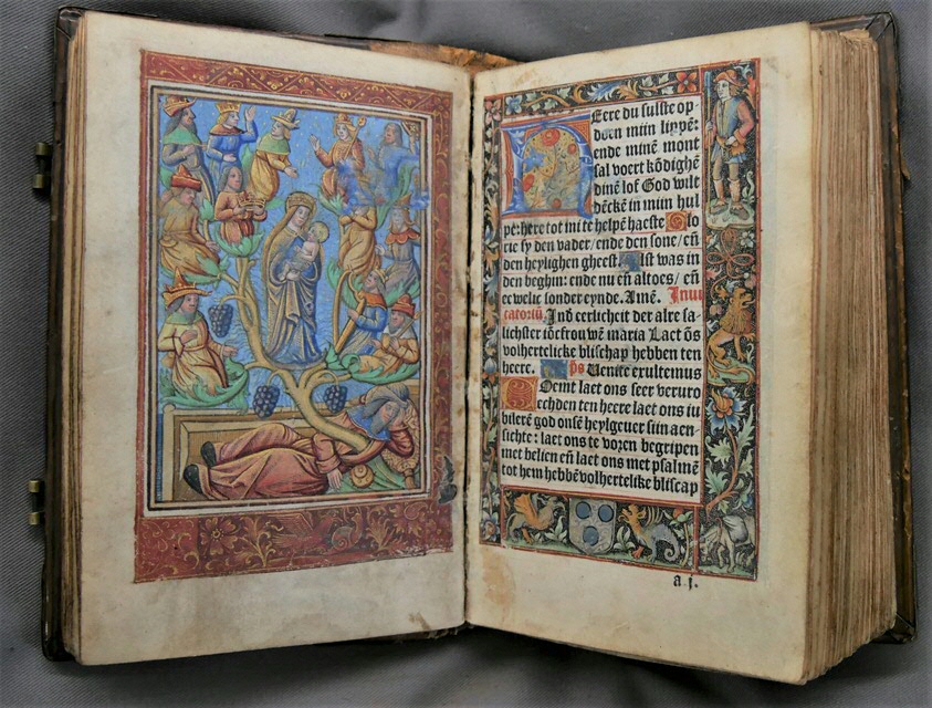
While printed books continued to be illuminated by hand, the spread of moveable-type printing also provided an impetus for the printing of images. Woodcuts had been used for printing single-leaf images on paper from the early fifteenth century onwards. As woodcuts could effectively be combined with metal type, allowing both text and image to be printed simultaneously, they would remain the most common method of book illustration for some centuries. Another method for printing images was the use of metalcuts. In this book of hours printed by Johannes Higman in Paris in 1497, metalcuts were adopted to provide illustrations and marginal decorations. This technique can be recognized by the white stippling in the dark printing ink, a typical feature of metalcuts whereby the metal is struck with punches.

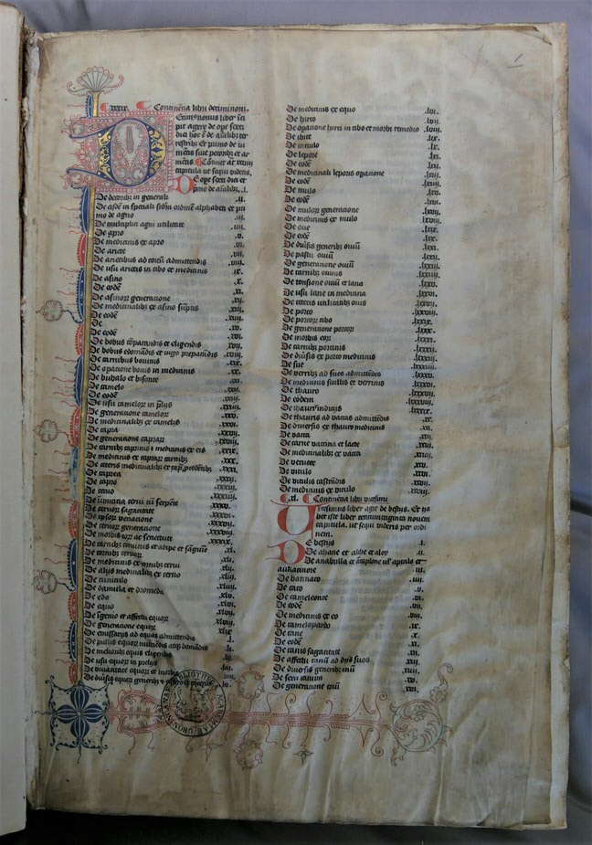
The left-hand page depicts the tree of Jesse, a family tree that schematically presents Christ’s genealogy going back to Jesse, as described in the biblical Book of Isaiah. On the right-hand folio, the margins have been decorated with more metalcuts to form a frame around the printed text. The floral motifs, monsters and animals have been coloured by hand. The coat of arms of the commissioner, a member of the Bleyswijck family, has been painted below the text. As there were no marginal decorations printed on the left-hand folio, these have been added by hand. In this sense, the book is a hybrid: it is both printed and hand painted. The two techniques of book production coexisted comfortably in the late fifteenth century. Occasionally, we even find books that contain both printed and handwritten text. The first printed leaves are missing from a copy of Vincent of Beauvais’ Speculum naturale and have been replaced by parchment manuscript leaves with the missing text, bound in with the textblock.

| Last modified: | 21 June 2021 09.14 a.m. |

