Research Digest: Understanding Surveillance’s Public Debate
| Date: | 18 October 2024 |
| Author: | Dario Rodighiero |

In this blog post, we kick off the new Research Digest series, where our faculty academics introduce us to their research topics and the broader societal questions they address. This week, Dr. Dario Rodighiero presents the Weather Map, a method for visually mapping public debates using newspaper articles. Focusing on surveillance, the map reveals how key actors and topics like privacy and international relations are organized into clusters through network visualization. Developed in the context of Dr. Rodighiero's fellowship at the Edgelands Institute, the Weather Map provides a unique way to explore complex public discourses and highlights the role of design in shaping how we interpret information.
1. Surveillance in Public Discourse
Surveillance is an emerging topic in the public debate, mostly driven by its controversial use visible in the numerous stories appearing in newspaper articles. For example, Pegasus — a spyware software sold under the Israeli Defense Ministry license to capture terrorists and criminals — was recently used to spy on journalists and human rights activists (Gupta 2023). The United States recently shot down in Montana a surveillance balloon allegedly sent by China, raising the political tension between the two countries (Cooper and Wong 2023). And South Korea successfully launched in space its first rocket to set up a network of national satellites, which will include a surveillance system in the near future (Sang-Hun 2022). All these stories draw a thin threshold between national interests and global security, intertwined with personal privacy, reminding us of the difficulty of grasping complex phenomena from the public discourse. Surveillance is no exception.
2. Weather Map, A Novel Method for Mapping Public Debates
The recent developments in the field of data visualization (Lima 2011) and digital tools (Rogers 2013) have opened up new opportunities to answer complex questions by analyzing and visualizing large datasets of information. The pedagogical method of controversy mapping — founded by Bruno Latour (2021) and investigated by different scholars around the world (Venturini and Munk 2022) — specifically created an interest in understanding the public debates by identifying key actors and interpersonal conflicts.
Situated in the field of controversy mapping, the Weather Map is a visual method developed to extract and visualize the most active actors and their dynamics from corpora of newspaper articles (Rodighiero and Daniélou 2023). Created by making use of the Media Cloud initiative (Roberts et al. 2021), the Weather Map applies network visualization and text analysis to map any public discourse in a series of spatially organized clusters of actors. Inspired by synoptic weather charts, the method employs the visual grammar of synoptic weather charts to represent emerging trends from a large corpus of texts.
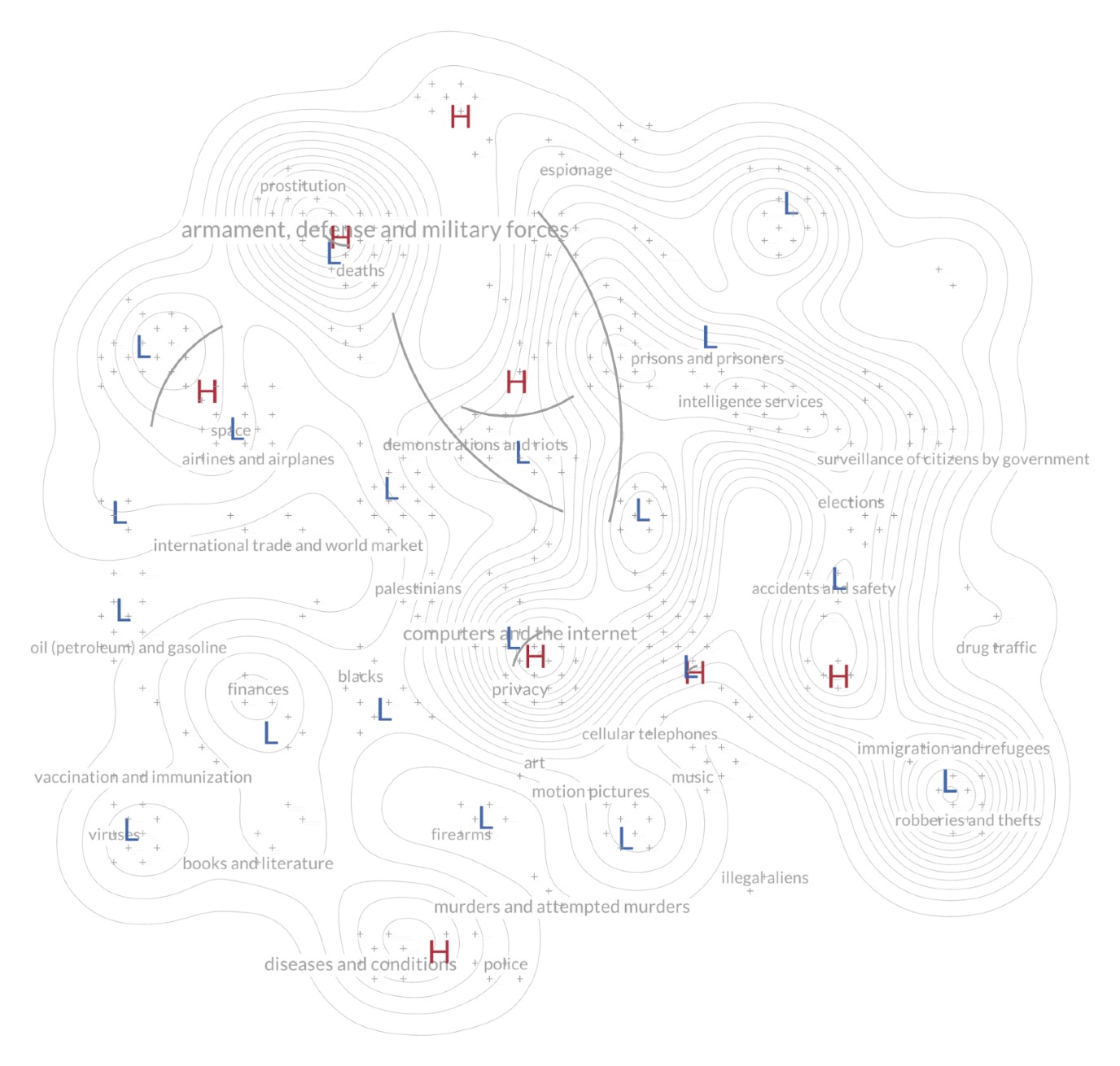
For the fellowship 2022–2023 at the Edgelands Institute, I have tailored the Weather Map model by downloading, analyzing, and mapping all the New York Times articles in which the term “surveillance” was mentioned at least once. The Media Cloud archive provided more than 3,000 newspaper articles from the last 13 years, leading to the identification of more than 20,000 actors mentioned in the body texts. This information was sorted by frequency and measured by co-citation, generating a map’s instance for surveillance in which clusters group together those actors frequently mentioned in the same articles (see Figure 1 below).

3. Guidelines for Looking at the Map
What we can see on the map is performative as it varies from individual to individual (Drucker 2014). The map’s reading starts from the interpretation of elevation lines that identify peaks of activity, indicated with the letter “H” in red — corresponding to the synoptic weather map’s high pressure. The New York Times’ taxonomy also helps to familiarize with the space, offering a glimpse on specific areas’ content. Once identified one cluster of potential interest, the reader can zoom using the interactive interface that embeds the map. This action triggers a swap by replacing the initial layer of information with a set of entities. Actors, or entities in text analysis’ jargon, represent individuals, places, organizations, and subjects that give shape to each cluster. Grouped when they often appear together in newspaper articles, actors give a sense of the reason each particular cluster exists.
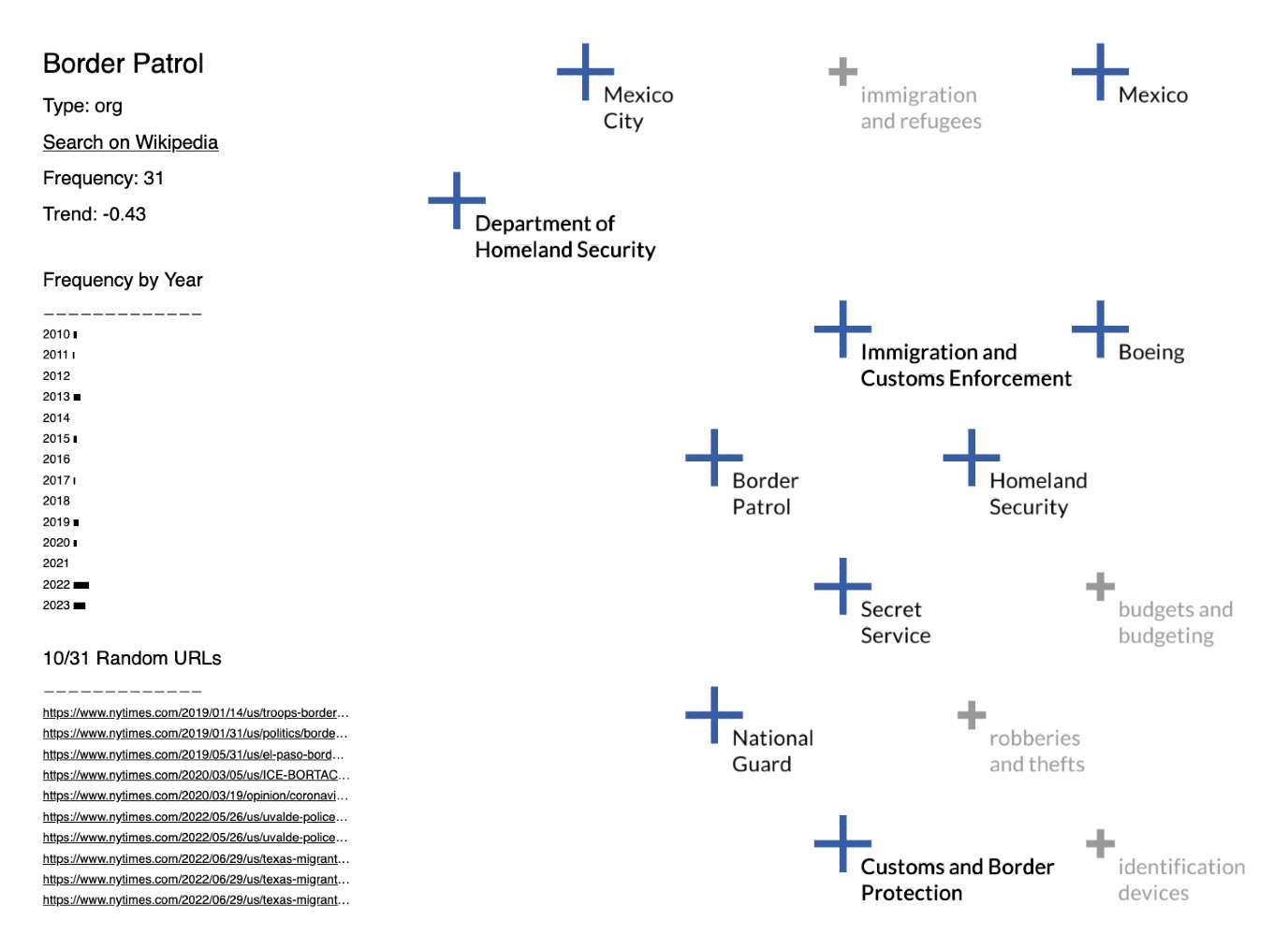
Figure 2, for instance, shows a cluster related to immigration and borders. The subjects in gray help give an idea of the cluster’s topic by using a model trained on the NYT corpus (Bhargava et al. 2017). On the other hand, in blue, the actors “Mexico” and “Mexico City” are two examples of place, while the actors “National Guard” and “Border Patrol” are two examples of organization. On the left panel, the actor “Border Patrol” is selected, showing some key characteristics like frequency trend and yearly distribution; in addition, a random list of URLs allows the reader to open those NYT newspapers articles that define the actor’s position in the map, in an attempt to connect to the information at source. The color code, which follows the visual grammar of synoptic weather charts, is blue when the actor’s trend is negative, which means lower than the average actors’ increase in the entire dataset on surveillance.

4. Findings and Insights
The Weather Map relies on the movement of zooming from the full picture to each newspaper article, connecting the visualization to the corresponding corpus. The map has the twofold function: to serve single articles and a comprehensive representation of trending topics on surveillance. Among these topics, it is possible to identify different main discussions: one is about the tension between individual and privacy on the web — visible in the middle of the map — where thousands of companies are profiling internet users to make profit out of personal data by selling them to governments and industries (Warzel 2019). Another discussion about armaments and international relations is situated at the top left of the map (Rubin and Schmitt 2019), while just below there is a cluster about space and sky surveillance (Overbye 2016). Finally, another key discussion is related to intelligence services and terrorism (Savage and Fandos 2020) — accessible from the central top right part of the map. Those are the most visible discussions composing today’s larger public debate on surveillance from the New York Times’ perspective.
5. Conclusion, the Role of Design in Shaping Public Discourse
All the clusters described above are related to surveillance but very specific to certain discourses. Although close reading and personal dedication are key to understanding our world, it is easy to miss the whole picture in this flood of digital information. The weather map aims at summarizing large public debates, paying attention to dedicated sub-discourses and their actors. Despite some exciting achievements, the project still presents limits and requires further development. However, it is essential to contextualize this project in the future developments to improve our ability to read more information. The way in which information will be accessible in the future opens an interesting reflection on platform design, and more specifically on how to manage the granularity of newspaper articles along with their aggregation through visual tools. The idea of looking at newspaper articles as one sole entity does not replace close reading, but offers a complementary view in which the totality of information is an intelligible object to observe through actor alliances and news threads over time. To use the words of Marshall McLuhan; we have the opportunity to redesign information in a manner that improves the potential of the present society.
Bibliography
-
Bhargava, Rahul, Jasmin Rubinovitz, Linas Valiukas, and rsingel. 2017. “Mediacloud/Nyt-News-Labeler: Tag News Stories Based on Models Trained on the NYT Corpus.” 2017. https://github.com/mediacloud/nyt-news-labeler .
-
Cooper, Helene, and Edward Wong. 2023. “Downing of Chinese Spy Balloon Ends Chapter in a Diplomatic Crisis.” The New York Times , February 4, 2023, sec. U.S. https://www.nytimes.com/2023/02/04/us/politics/chinese-spy-balloon-shot-down.html .
-
Drucker, Johanna. 2014. Graphesis: Visual Forms of Knowledge Production . MetaLABprojects. Harvard University Press.
-
Gupta, Gaya. 2023. “A Report of a Pegasus Attack on One Russian Journalist Sets off a Flurry of Concern among Others.” The New York Times , September 14, 2023, sec. World. https://www.nytimes.com/2023/09/14/world/europe/galina-timchenko-meduza-pegagus-spyware-russia.html .
-
Latour, Bruno. 2021. “Préface.” In Controverses mode d’emploi , edited by Clémence Seurat and Thomas Tari, 11–21. Paris: Presses de Sciences Po.
-
Lima, Manuel. 2011. Visual Complexity: Mapping Patterns of Information . New York: Princeton Architectural Press.
-
Overbye, Dennis. 2016. “A Wider-Eyed Watchdog of the Clutter Surrounding Earth.” The New York Times , October 24, 2016, sec. Science. https://www.nytimes.com/2016/10/25/science/darpa-space-surveillance-telescope.html .
-
Roberts, Hal, Rahul Bhargava, Linas Valiukas, Dennis Jen, Momin M. Malik, Cindy Sherman Bishop, Emily B. Ndulue, et al. 2021. “Media Cloud: Massive Open Source Collection of Global News on the Open Web.” In Proceedings of the Fifteenth International AAAI Conference on Web and Social Media (ICWSM 2021) , 1034–45.
-
Rodighiero, Dario, and Jean Daniélou. 2023. “Weather Map: A Diachronic Visual Model for Controversy Mapping.” In Zoomland: Exploring Scale in Digital History and Humanities , edited by Florentina Armaselu and Andreas Fickers, 449–66. De Gruyter. https://doi.org/10.1515/9783111317779-017 .
-
Rogers, Richard. 2013. Digital Methods . MIT Press.
-
Rubin, Alissa J., and Eric Schmitt. 2019. “Trump’s Plan for U.S. Forces in Iraq Met With Unified Rejection in Baghdad.” The New York Times , February 5, 2019, sec. World. https://www.nytimes.com/2019/02/04/world/middleeast/trump-iraq-iran-reaction.html .
-
Sang-Hun, Choe. 2022. “SOuth Korea Launches Satellite With Its Own Rocket for the First Time.” The New York Times , June 21, 2022, sec. World. https://www.nytimes.com/2022/06/21/world/asia/south-korea-rocket-launch-nuri.html .
-
Savage, Charlie, and Nicholas Fandos. 2020. “Surveillance Tools Will Lapse as Trump Signals Possible Veto.” The New York Times , March 12, 2020, sec. U.S. https://www.nytimes.com/2020/03/12/us/politics/trump-surveillance-bill.html .
-
Venturini, Tommaso, and Anders Kristian Munk. 2022. Controversy Mapping: A Field Guide . Cambridge, UK ; Medford, MA: Polity.
-
Warzel, Charlie. 2019. “Opinion | We Are Drowning in Data.” The New York Times , May 7, 2019, sec. Opinion. https://www.nytimes.com/2019/05/07/opinion/data-privacy.html .
About the author

Dario Rodighiero is an Assistant Professor of Sciences and Technology Studies at the University of Groningen. He maintains affiliations with Harvard University and holds a position as a faculty associate at the Berkman Klein Center for Internet & Society. Dario specializes in knowledge design, critical data, and digital humanities, mapping scientific organizations and cultural institutions. His approach allows him to bridge gaps between diverse fields, serving as a mediator for inter-disciplinary projects and initiatives.
> View Dario's full profile

