Modular illustration system in practice
UG house style
The illustration system is applied within the context of the UG house style. To safeguard the recognition of the brand, all other house style guidelines remain in effect.
A few important ones:
-
The UG has a fixed colour palette. For the sake of recognition, red is used in all communications.
-
Out of the house style fonts , the house styles of the Schools employ Arial. Â
General information
-
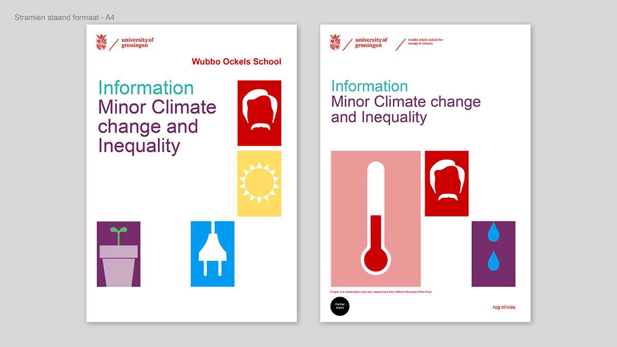
Always use the icons in combination with each other. Use at least two and, preferably, three or more icons.
-
The corporate icons can be used by all Schools.
-
The Schools can borrow each other's icons, with the exception of the core icon.
-
Always use the core icon of the School for the sake of recognition.
-
If the communication calls for it, an illustration box can be filled with a photo.
Grids
In order to facilitate the application of the illustration system and create unity and consistency between the communications of the different Schools, we use grids.
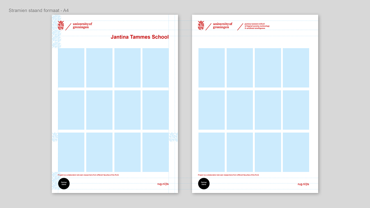
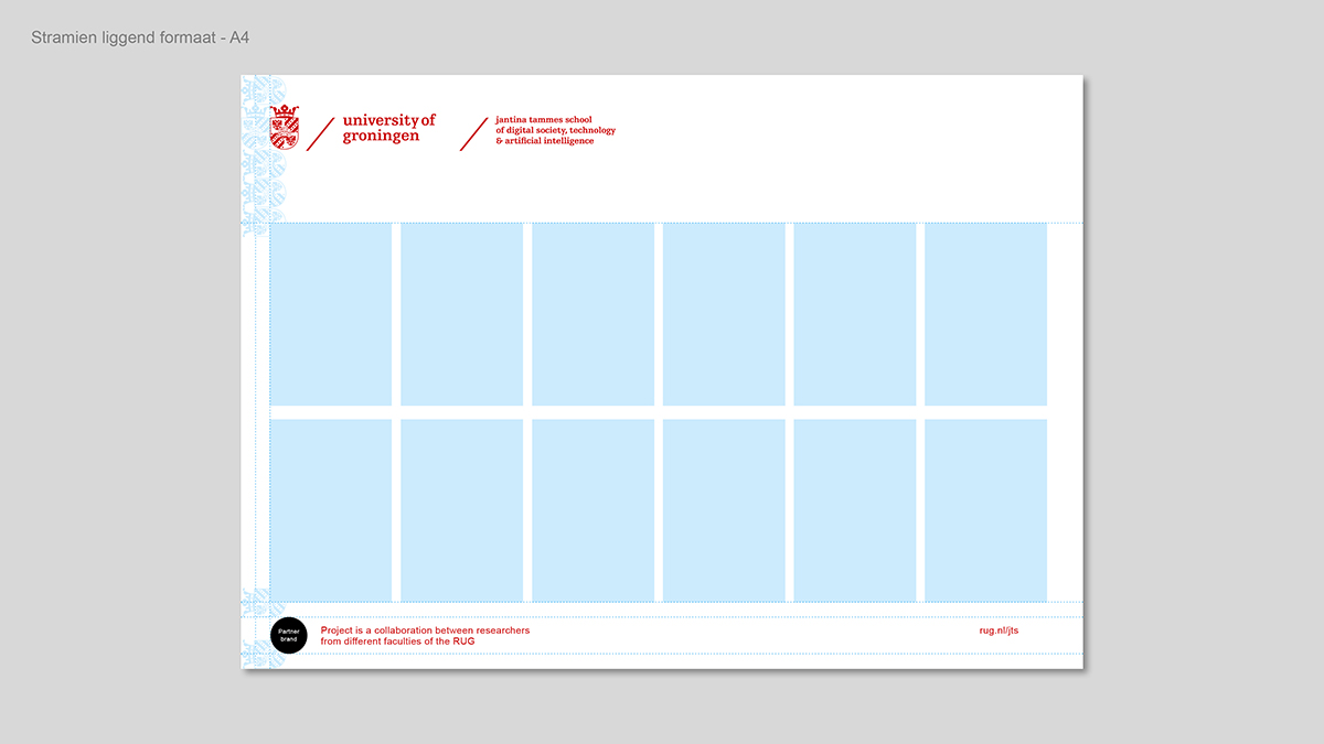
We have a grid for a portrait DIN A4 format and for a landscape A4 format. If required, the grids can be made larger or smaller to fit other A formats.
Explanation of the grids
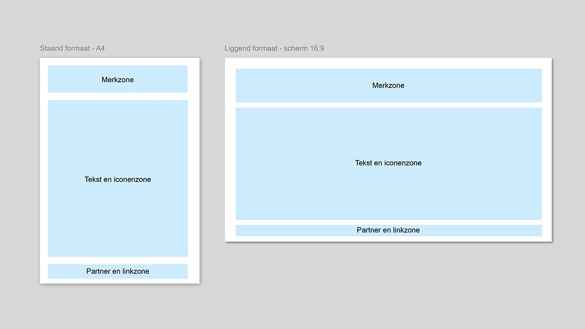
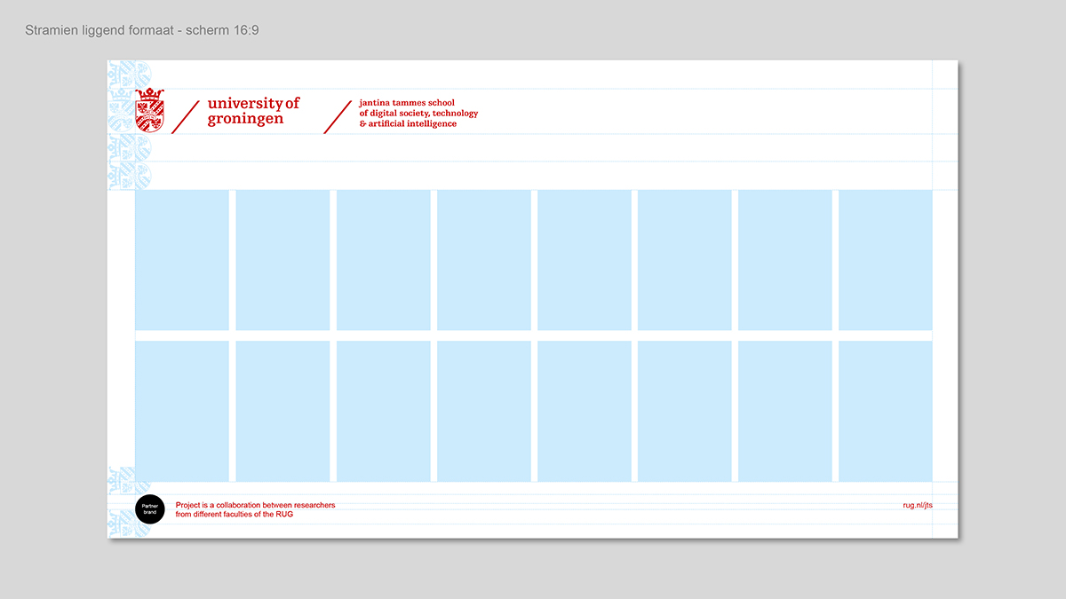
The grid contains a brand section (1), a section reserved for text and icons (2), and a section where you can place partner logos and hyperlinks (3). The margins and ratios of the grid are based on the measurements of the coat of arms of the logo.
Brand section
-
The brand section contains the logo and possibly a second branding element, but never any other text, icons, or images.
-
The measurements of the corporate logo equal 1/3.5 in portrait format or 1/5 in landscape format of the width. In this calculation, no second branding element is added to the corporate logo.
Text and icons section
-
In this section, icons, photos, and text can be combined. Text or images can be placed in a box or a combination of multiple boxes.
Partner and hyperlink section
This section is intended for:
-
logos of collaboration partners, optionally with an explanatory sentence.
-
a URL
-
a QR code
The margins and proportions of the partner and hyperlink section in a portrait format are designed differently than those of a landscape format.
Grid for portrait format A4
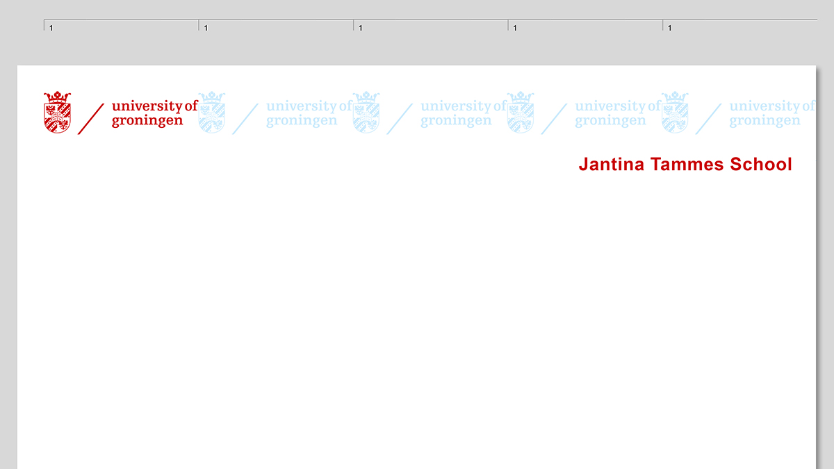
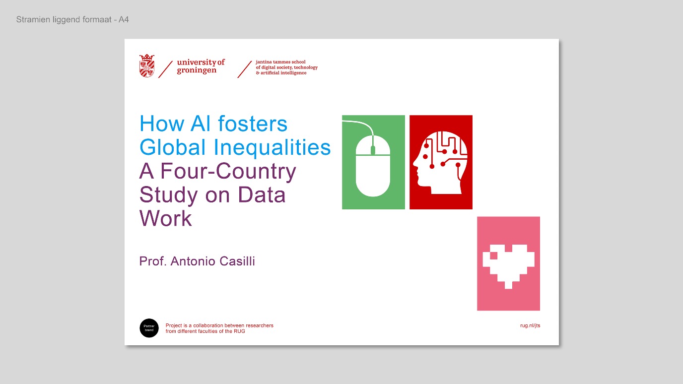
Grid for landscape format A4
Grid with 16:9 aspect ratio (also for screen)
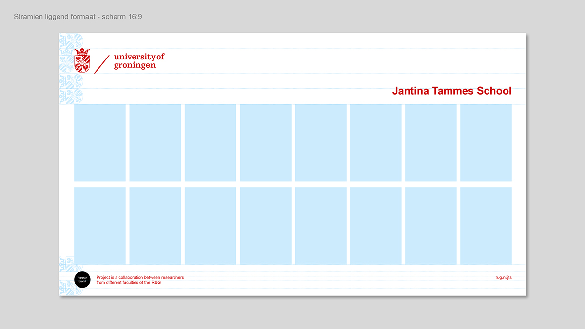
To facilitate working with grids, we are in the process of creating templates for InDesign or Canva.
| Last modified: | 29 May 2024 12.17 p.m. |
