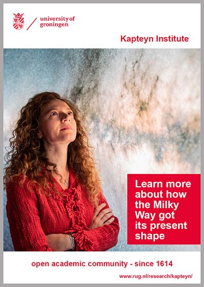
Bar with logo at the top left
The University of Groningen brand really stands out against the white bar. The space to the right of the logo remains empty.
The white bar is mandatory when additional colours from the secondary palette is being used.
There is the option of adding an extra bar featuring the name of the organizational unit in question.


| Last modified: | 12 March 2024 09.35 a.m. |
View this page in: Nederlands
